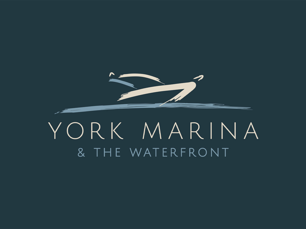


York Marina Identity Refresh

York Marina Identity Refresh Visual identity refresh for York Marina. Changing colours plus a new Waterfront Café logo and new lock up logos. We were tasked with creating a logo for The Waterfront Café – York Marina’s onsite café. The logo had to work alongside and compliment the York Marina logo. We suggested the use […]
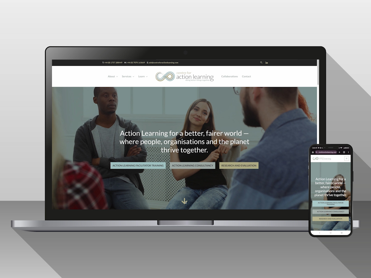
Centre for Action Learning Website
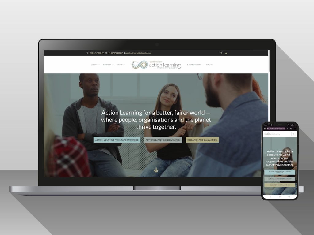
Centre for Action Learning Website Multipage website designed and built for Centre for Action Learning Ltd. Featuring informational pages, interactive SVG map, PDF downloads, and contact form. Web development Information pages Interactive SVG map PDF downloads Contact forms Counter News articles https://vimeo.com/1181513252
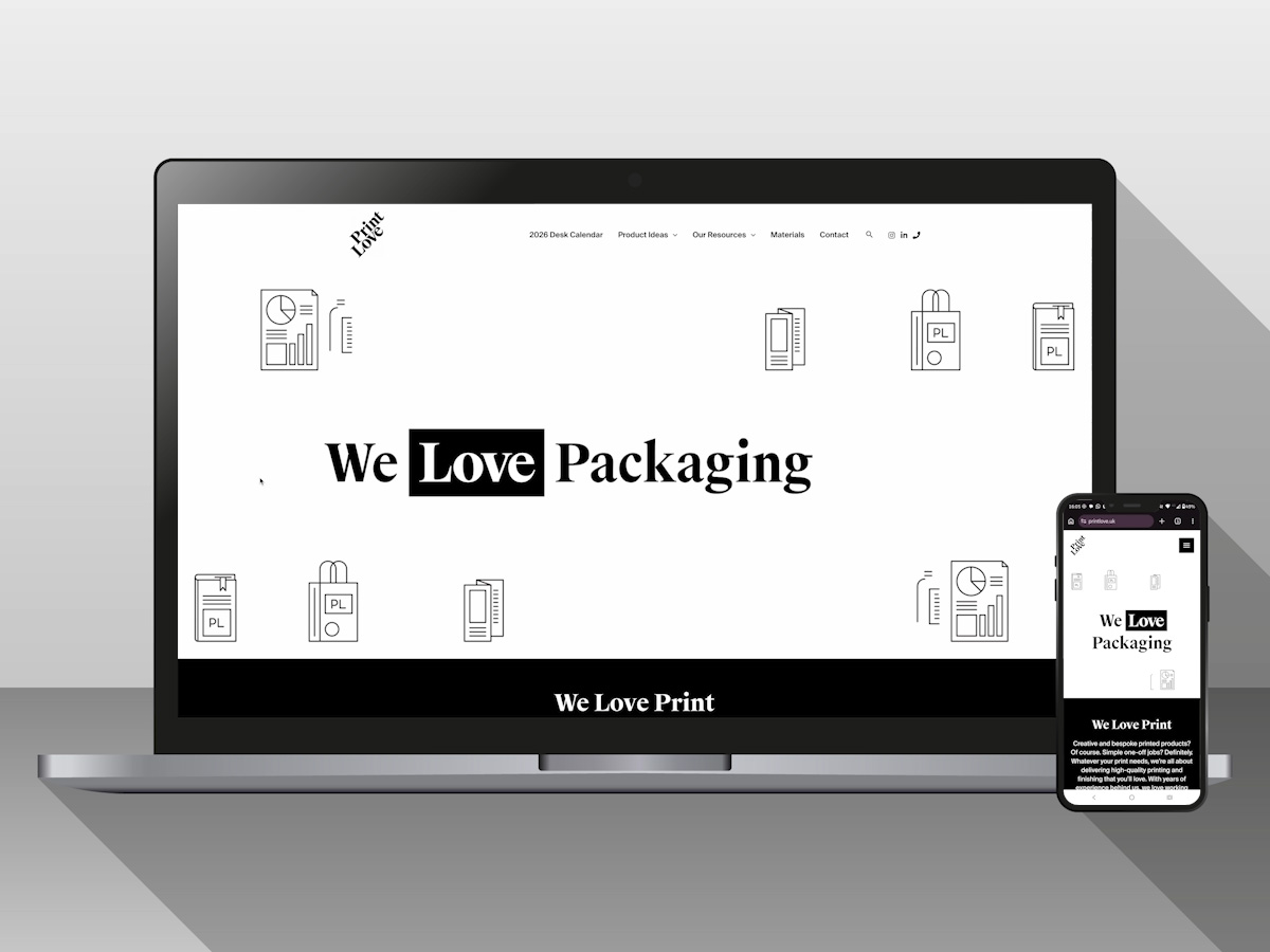
Print Love Website
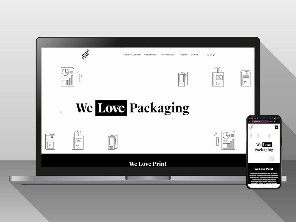
Print Love Website Multipage website designed and built for Print Love Ltd. Featuring informational pages, product mockups, bespoke icons/illustrations, and animated videos. Web hosting Web development Maintenance Information pages Product mock ups Illustrations Contact forms Image galleries Animated videos Instagram feed https://vimeo.com/1181247430
LGS Projects Website
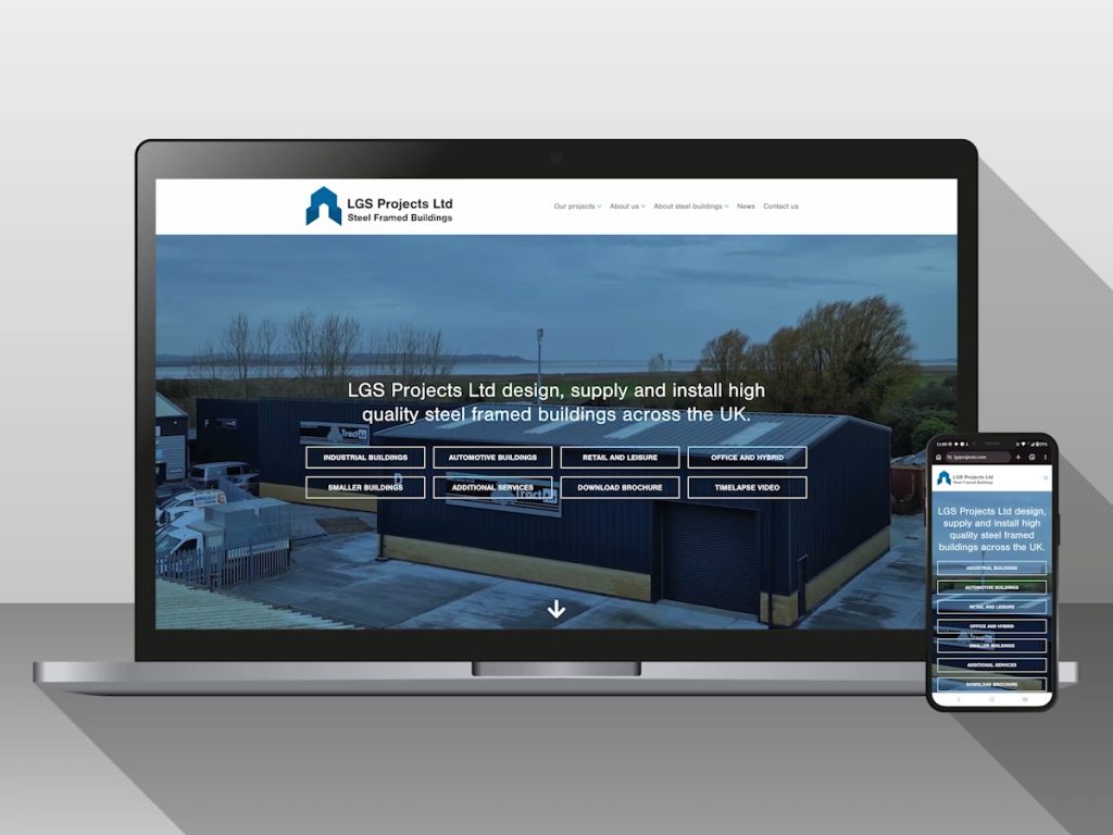
LGS Projects Website Multipage website designed and built for LGS Projects Ltd. Featuring informational pages, case studies, PDF downloads, and contact form. Web hosting Web development Maintenance Information pages Case studies PDF downloads Image galleries Contact forms LinkedIn feed https://vimeo.com/1177732537
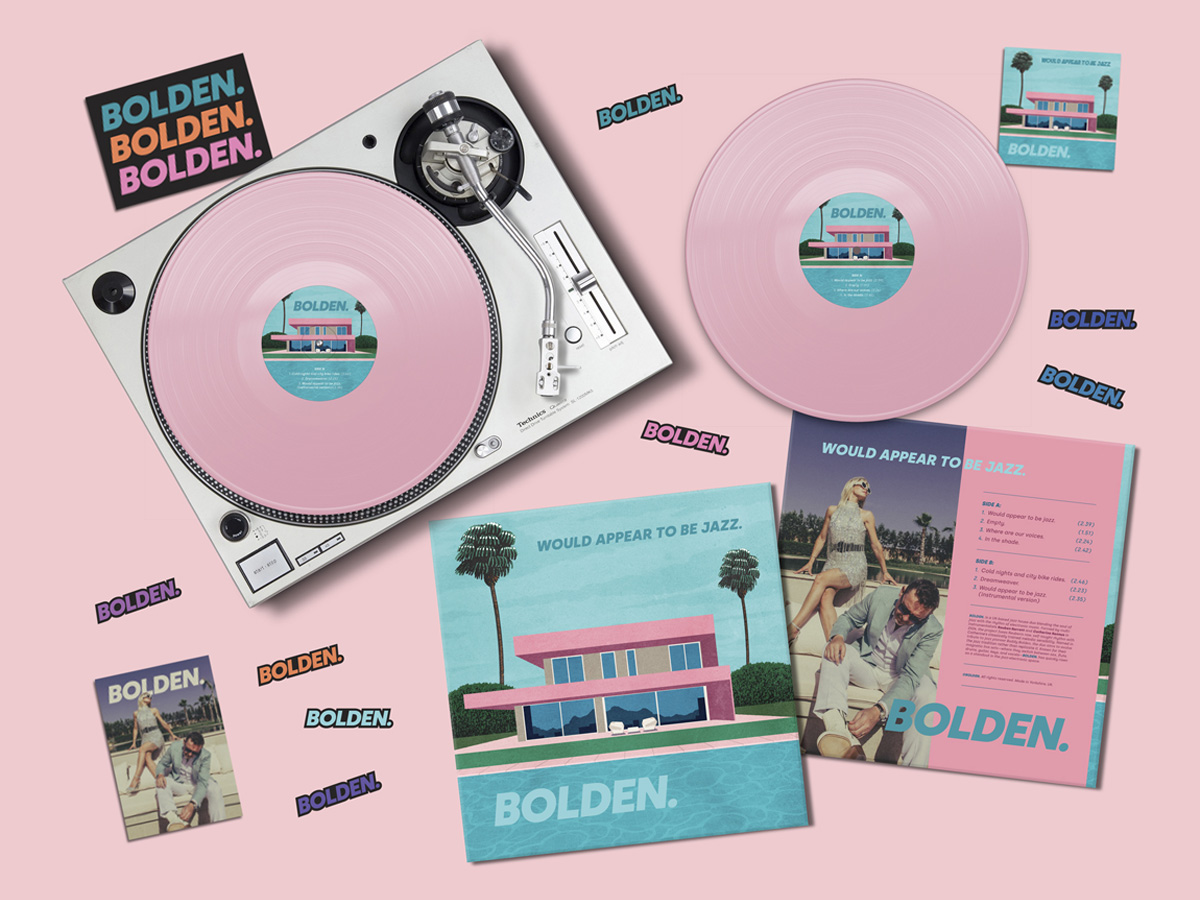
Bolden: Would Appear To Be Jazz

Bolden: Would Appear To Be Jazz Designs for jazz duo, Bolden‘s, first album and tour across the UK, Europe and America. Jump to:Vinyl Cover and LabelPostersSocial Media GraphicsStickersPostcardsT-ShirtsMerchandise Vinyl Cover and Label Posters Social Media Graphics Including Instagram posts and stories, templates for venues, and animated reel. https://hba-testing.co.uk/wp-content/uploads/2026/03/Bolden-Release-Reel.mp4 Stickers Postcards T-Shirts Merchandise
Bolden Visual Identity
Bolden Visual Identity Visual identity design for jazz duo, Bolden. The client wanted something simple and bold, with a retro feel. We chose to use the Silka typeface and no/all colours for maximum versatility. Silka is a modern geometric typeface. Geometric styles became popular in the early 20th century and enjoyed a resurgence in the 1970s/1980s. With its […]